PROJECT: GOOD.STORE + KEATS & CO

SCOPE:
Brand Strategy, Brand Architecture, E-commerce Branding, Product Branding Packaging, Illustration

e-commerce BRANDINg & Beverage Packaging Design
A store built to make change, not profit.
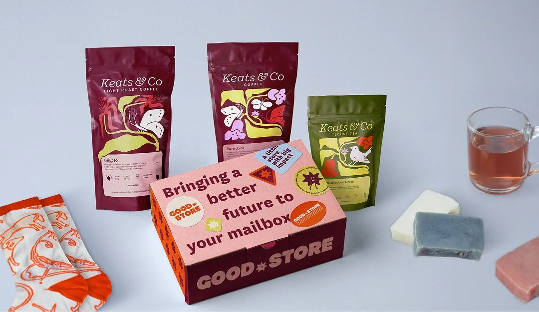
Founded by creators Hank and John Green, Good.Store is an online retailer built around turning everyday purchases into support for meaningful causes. First Pick created the e-commerce brand, then extended its world into Keats & Co., a tea line with its own identity, illustration style, and packaging system. The challenge was to give the product brand a distinct personality while keeping it clearly connected to the larger Good.Store mission.
THE IMPACT THAT FOLLOWED THE REBRAND
$5.5M+
Donated since rebrand
$13M+
Donated in Good.Store’s lifetime
10%
Year-over-year growth for Good.Store
10%
Year-over-year growth for Keats & Co
THE BRAND IDENTITY
Designing the parent brand
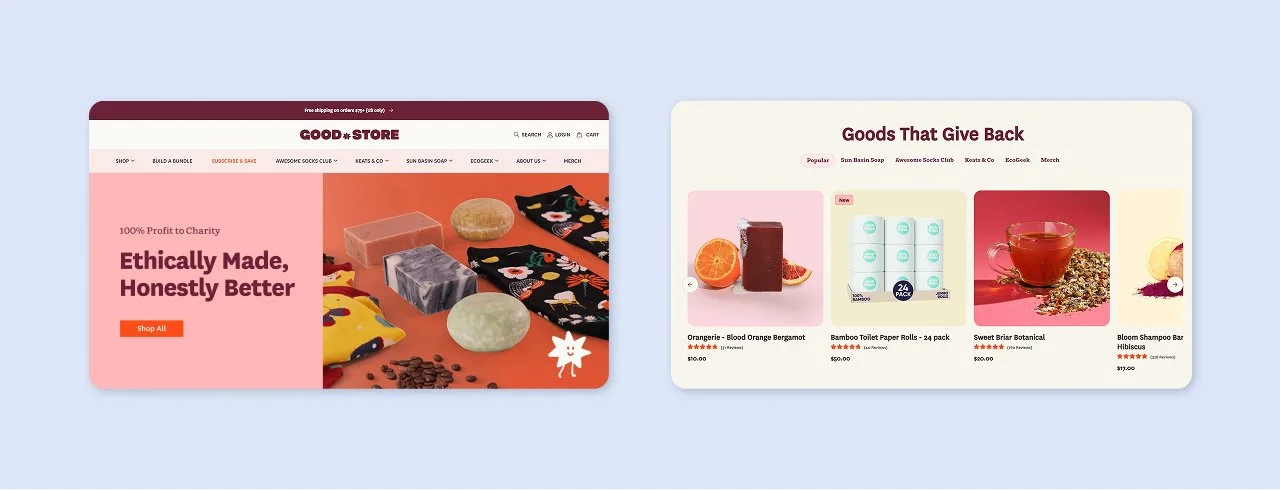
Our goal with Good.Store’s branding was to create a warm, inviting, and playful brand experience that resonates with a socially conscious and diverse audience. We opted for a visual language that was bold and colorful, putting a modern spin on retro inspired aesthetics.
THE BRAND IDENTITY
Turning a naming constraint into the heart of the brand.
Good.Store began with a practical naming challenge. Rather than treat the period as a technical detail, we turned it into Dot, a star-shaped mascot inspired by the gold stars children receive for good work and good deeds. The connection to learning felt especially meaningful for a brand founded by Hank and John Green.
Dot became a character customers could connect with, a flexible asset for merchandise, and an Easter egg across Good.Store’s other product packaging. What started as a logistical constraint became one of the brand’s most recognizable elements.

Keats & Co COFFEE & TEA BRANDING AND PACKAGING

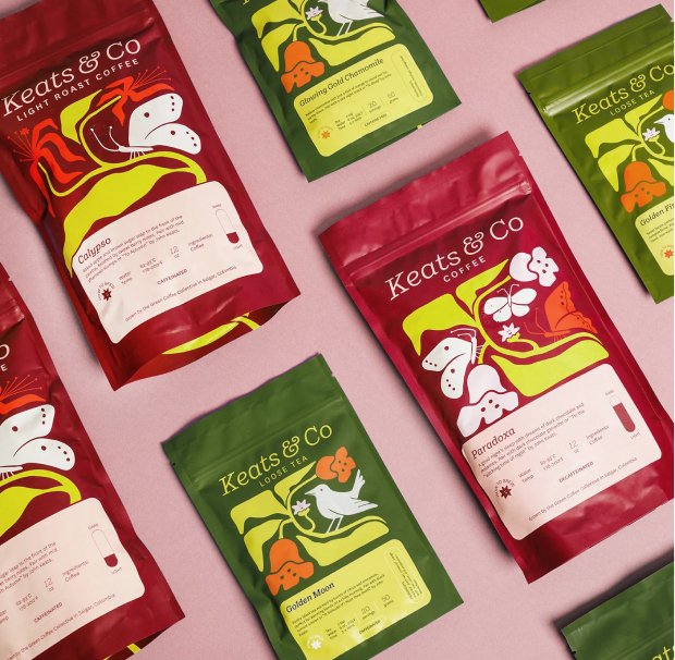
ILLUSTRATION & PACKAGING DESIGN
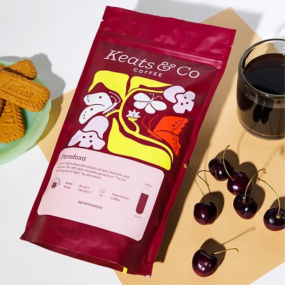
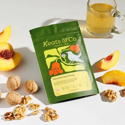
Following the Good.Store rebrand, First Pick created the coffee and tea brand design and packaging for Keats & Co., a new product line that donates all proceeds to tuberculosis treatment. Keats & Co. needed an identity strong enough to stand on its own while still feeling clearly connected to the Good.Store parent brand.
The color palette draws from Good.Store’s brand system, then shifts across the coffee and tea lines to create clear product distinction. Dot also appears as a subtle Easter egg within the packaging illustrations, tying Keats & Co. back to the parent brand.
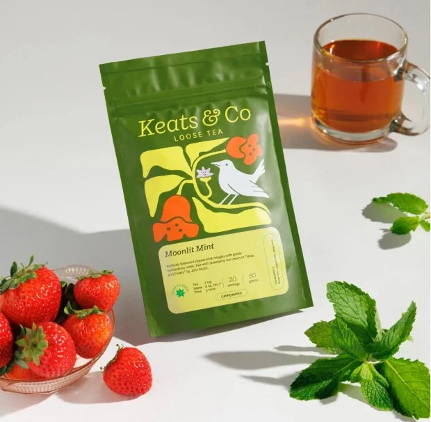
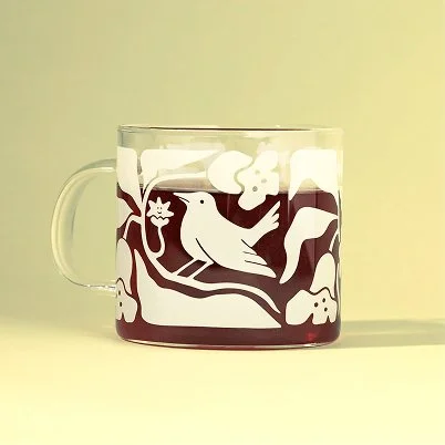
The Keats & Co. coffee and tea packaging was inspired by its namesake, poet John Keats, who died of tuberculosis. Each custom illustration features flora and fauna referenced in his poetry, historically connected to tuberculosis treatment, or native to Sierra Leone, where Good.Store supports much of its charitable work.
Together, the illustrations create a cohesive packaging system while giving every coffee and tea variety its own distinct story.


A Word from Good.Store’s team
“First Pick gave us more than a new look. They created a strong, scalable foundation for Good.Store, then built Keats & Co. in a way that felt distinct while still connected to the parent brand. Customers have especially connected with Dot, and both Good.Store and our Keats & Co. coffee and tea business have continued to see double-digit year-over-year growth. The process was fast, thoughtful, and exceptionally well organized, and the work continues to support where we are headed.”

CEO